Images
https://support.moderncampus.com/learn-omni-cms/pages-files/images.html
Image Sizes
- 2-column header 750x500 (3:2)
- Images within content 636x358 (16:9)
- Full width header 1920x650
- Banner card panel 1920x530
- Interactive cards 325x325
- Headshots 300x375
- Icons 80x150 svg
Alt tags
Alt text is important for accessibility purposes. Since screen readers already announce if an image is an image, you do not need to include the words “picture of” or “image of.” The alt tag should be a short description of an image. Avoid using specific gender or race information in alt text unless that information is confirmed.
Inserting an Image
- Click the Insert/Edit Image icon.
- Click the Browse icon to browse to the image, assigning the image with a dependency tag.
- Once the image has been selected, click Insert. Alternatively, you may double-click an image in the list or thumbnail view.
- Enter an alt value for the Image Description field and an image title.
- Click Insert.
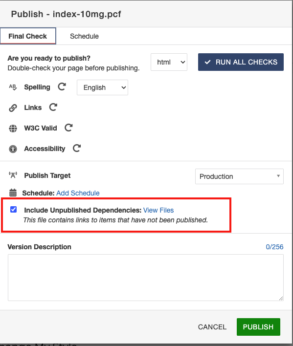
- Please note: When linking to an image or other binary file from staging the file must be published to production. This can be accomplished by making sure to check "Include Unpublished Dependencies" on publish dialog box.
Editing an Inserted Image
- Click the Insert/Edit Image icon.
- Make edits.
- Click update.
Uploading a new version
A new version of an image can be uploaded over the old version if the exact filename is used.
From the select image dialog box, navigate to the correct folder, then click the upload button. In the upload dialog box, click the checkbox "Overwrite Existing." Click "+ ADD" button or drop file from desktop and click "upload."
Icons
Icons are generally used in the fast facts/facts, figures, earnings component for quick facts or fast facts. See iconography available
Icons are available in different colors. White icons should be used for NSU blue or mid-blue backgrounds. The green and orange icons should not be used.
Videos
Videos can be added several ways – using media button in wysiwyg editor or as a component, small or large.
To add a background color for video, add the WYSISWYG with background color snippet and add embed the video in the content section.
Video carousel offers a playlist option.
Embedding a Video
Embedding a YouTube Video
- Navigate to the page where you wish to place the YouTube video.
- Check out the page.
- While editing an editable region, click Insert Component in the WYSIWYG editor toolbar.
- ** Add photo of toolbar **
- In the Choose Component box, click a component name.
- Click Insert.
- Under Edit Component, enter information in the form fields.
- Click Save.
Embedding other content with an HTML Embed Code
- From the WYSIWYG editor go to the content area you wish to modify.
- Click Edit Content Area.
- Click the film strip icon in the top bar. When hovered over it will say Insert/Embedded Media.
- From the video's webpage gather the HTML code for the video.
- Copy the HTML coding.
- On the Insert/Edit Embedded Media popup click the source tab.
- Erase the contents of the source box and paste the HTML coding for the video.
- Click Insert.
- Click Save.
- Click Publish to make the page go live.
Embedding a .mp4 Video
- From the WYSIWYG editor go to the content area you wish to modify.
- Click Edit Content Area.
- Click the film strip icon in the top bar. When hovered over it will say Insert/Embedded Media.
- The Type should be HTML5 Video.
- For the File / URL click on the Browse icon and navigate to your file.
Note: The .mp4 will have to have been uploaded to Modern Campus CMS and set as published. - Click Insert after selecting the video.
Video Carousel
To display three or more videos as a playlist, use the video carousel component.
Accepted video formats:
- YouTube
- Kaltura
- MP4
Upload the MP4 into an assets/resources folder and then link to the file.
For YouTube and Kaltura, paste in the embed code.
Video description is optional, as is the "Watch More" label and link.
